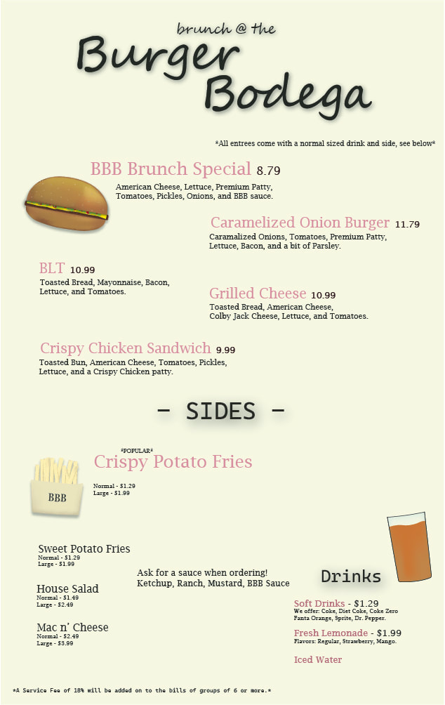
Even though I just made this recently, I really like it. I like how I did the burger and the shading, and I really like the whole aesthetic of the menu. I also am pretty proud of the fries and I think the depth effect that I gave them looks super cool, as well as adding some burnt pieces to parts of the fries because I wanted them to really fit the Crispy part of the name. Also I tried to make the prices seem pretty realistic, if this was a real restaurant it wouldn't be really really fancy, just nice.
Type Specimen (2/26/24) - Illustrator
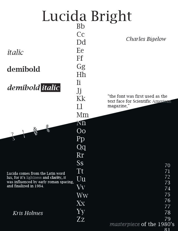
I think this was my favorite thing that I've made because I really like the contrast and I think the years in the bottom right were a unique way to showcase all the numbers in that specific text. I also used the letters to split up the page into 2 halves, and then the black and white to further split it. I also liked how I showcased the symbols on the left because it showed it in both a black color and white color and overall I think it was cool how the colors changed.
Shapes and Text (3/7/24) - Illustrator
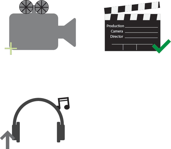
I liked this project because I go to be creative with the symbols, however I wanted to go for a more simplistic look. As if it would be used on something official, so probably not a game but more like a test or licensing. Looking back I think the headphones are my favorite, I feel like they look like real ones and I think I was able to capture the "listening to music" feel of it.
UV Unwrap Project (2/21/24) - Photoshop/3ds
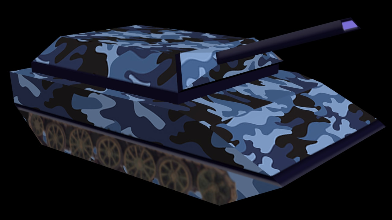
This project was difficult because of all the alignment that I had to do. However I'm still proud of it because I managed to get it done without making too many mistakes, and I was able to use a tank that I had made a while ago. I was thinking of ideas and even though blue camo doesn't really work out I think it looks cool.
